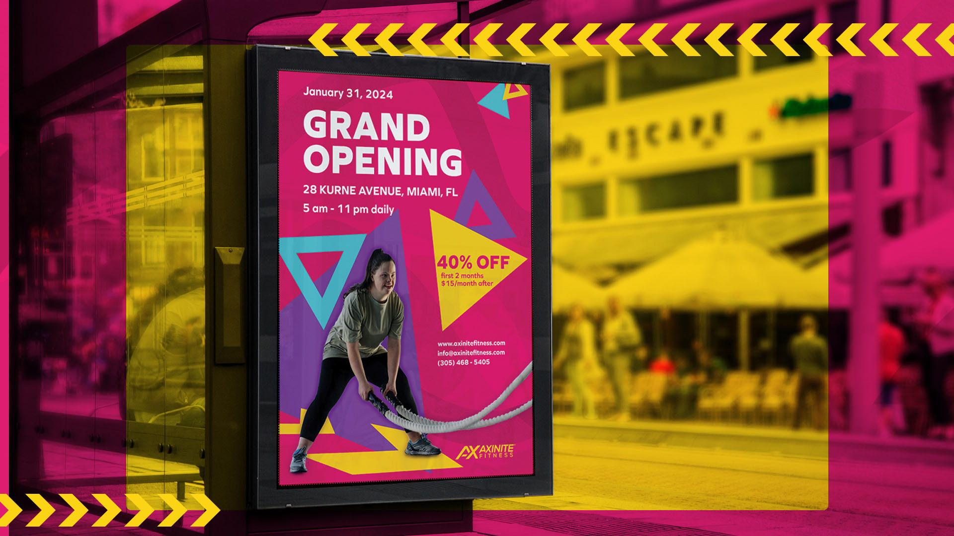

The Visuals
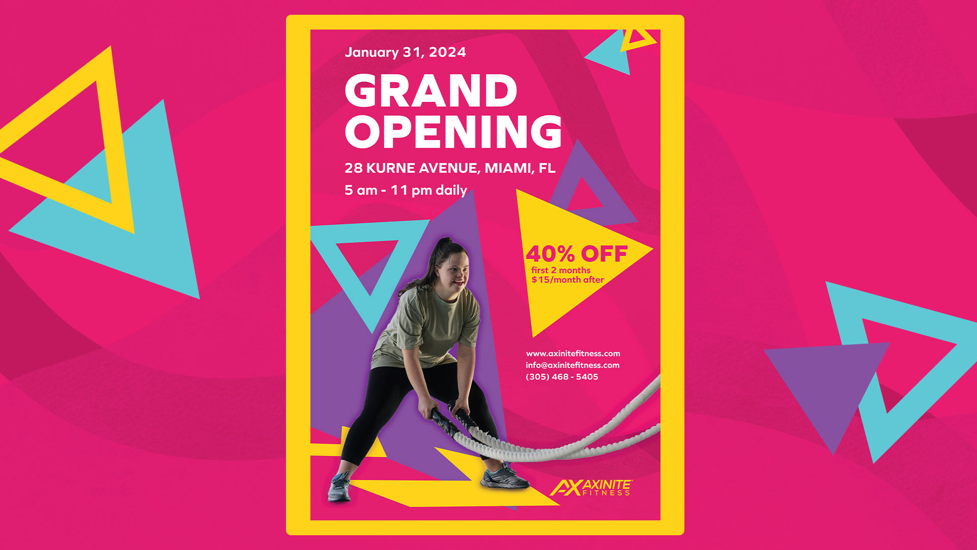
The main goal I had for this poster ad is to promote the grand opening of Axinite's first gym at their first location with the help of their inspiration to the 80s aerobics aesthetic.
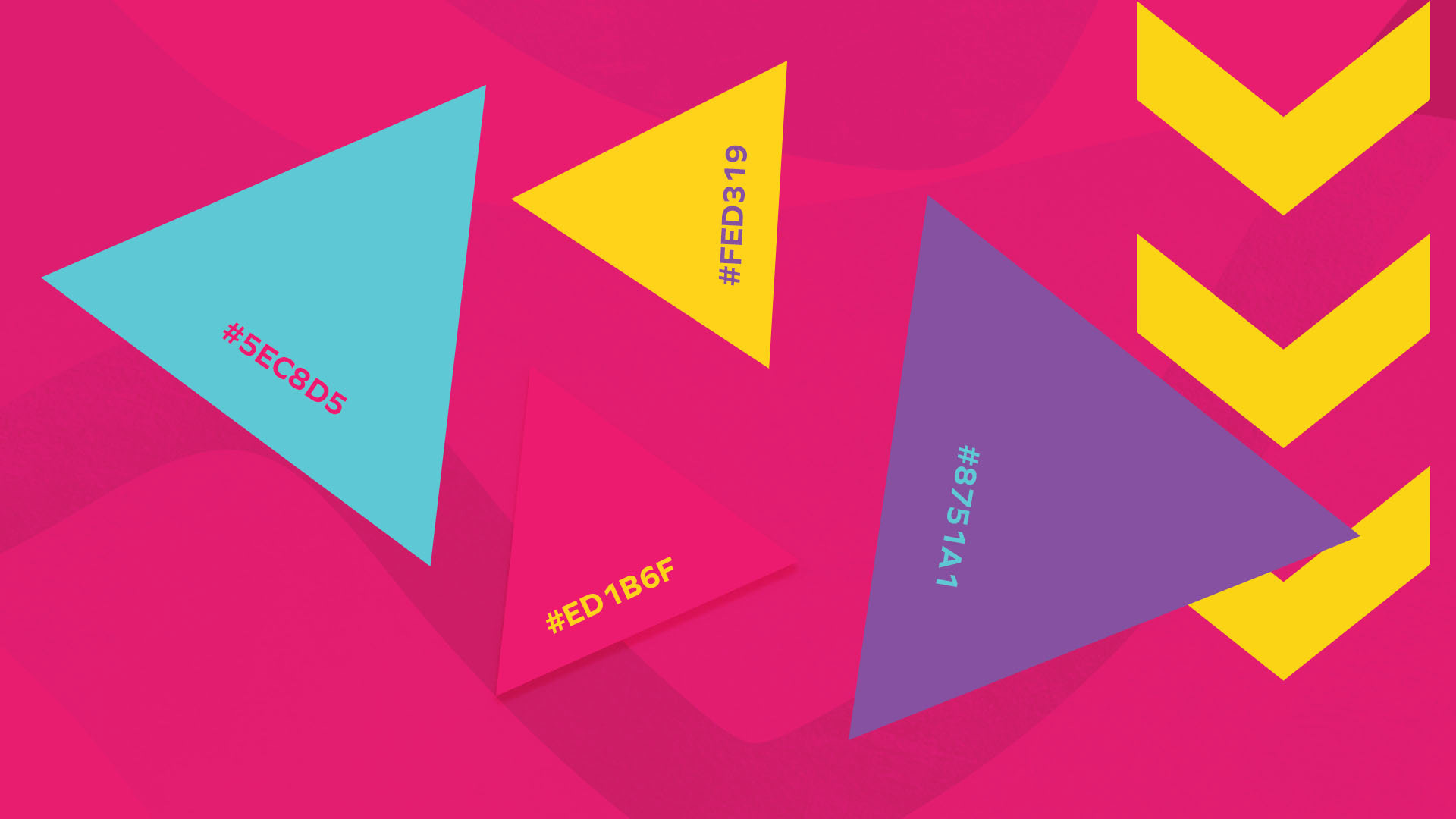
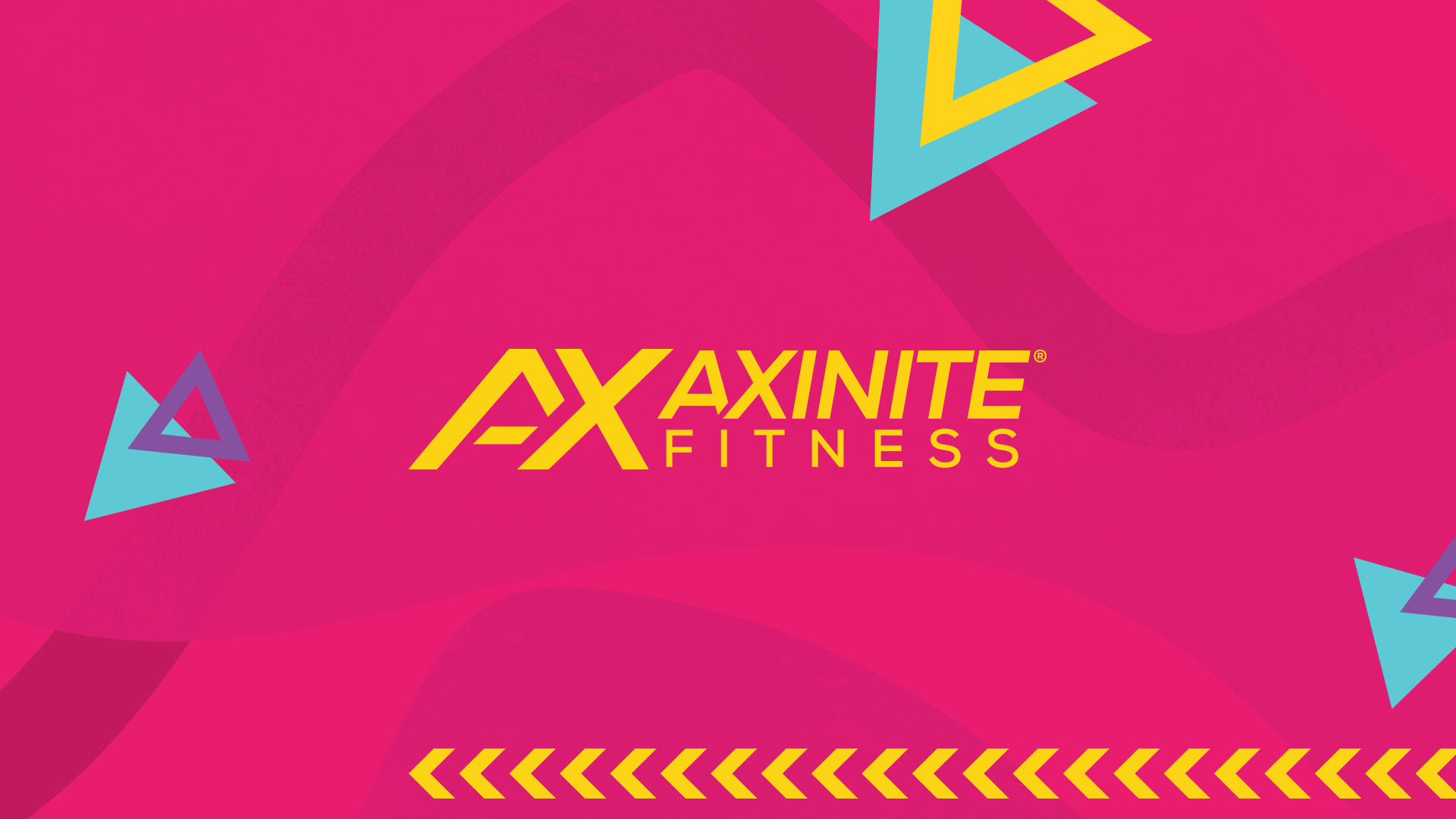
The colour palette I chose for this poster ad were mainly based off on the outfits that people had worn during the aerobics workout which are fun and bright and these are the colours that I found were commonly used during that time.
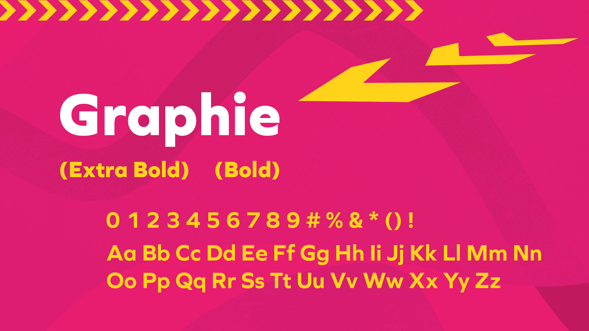
Graphie is a sans-serif font in which it features a clear-cut corner that has a strong and vibrant straight lines, and has a large x-height making it accessible and gives off a modern touch which fits well to Axinite's brand style of a modern gym but with an 80s aesthetic.
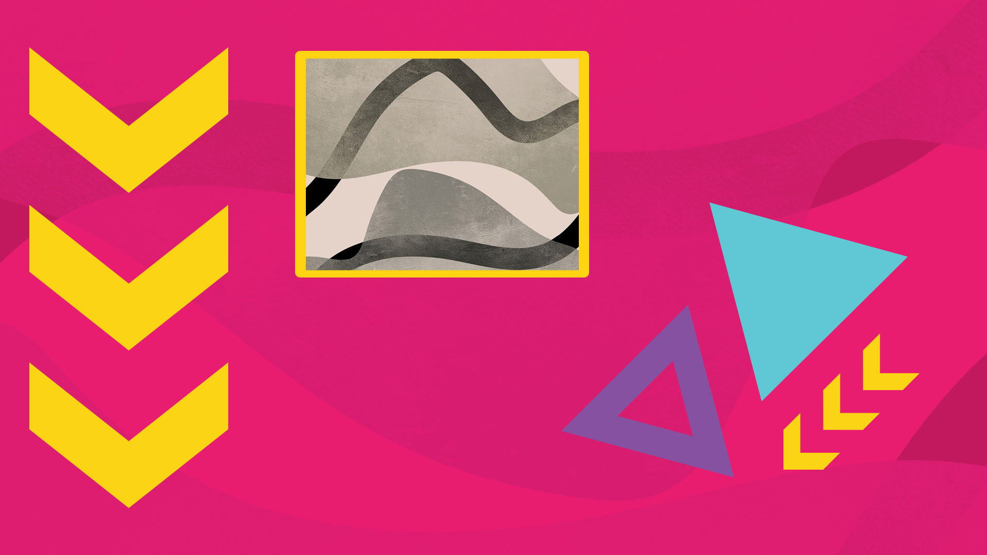
I chose flat geometric shapes to showcase the company's main inspiration. The shape of the triangles also displays the idea of pushing oneself to the limits, which gives the audience the drive to do the impossible especially workout routines. These shapes are also accompanied by this grunge effect as a texture background.
The Poster
The poster ad displays the 80s aesthetic by using the visuals I've chosen that I believe that fits to Axinite Fitness's brand style in which they are looking for something bright and vibrant designs that makes it fun for their audience to feel.
It also highlights the important details of their grand opening and the promotion that they are offering.
I chose this model because I wanted the poster to be inviting and for everyone to try out. I want to make sure that when they see this poster, they wouldn't feel as intimidated as most gym posters do in which it features muscular people and has dark vibe to show how intense it would be and that's what Axinite Fitness wanted to avoid. I believe that by having a model that is closer to their main audience which is basically everyone, by having this model, I feel like it will connect some people who wants to try workout exercises and just have fun with it.