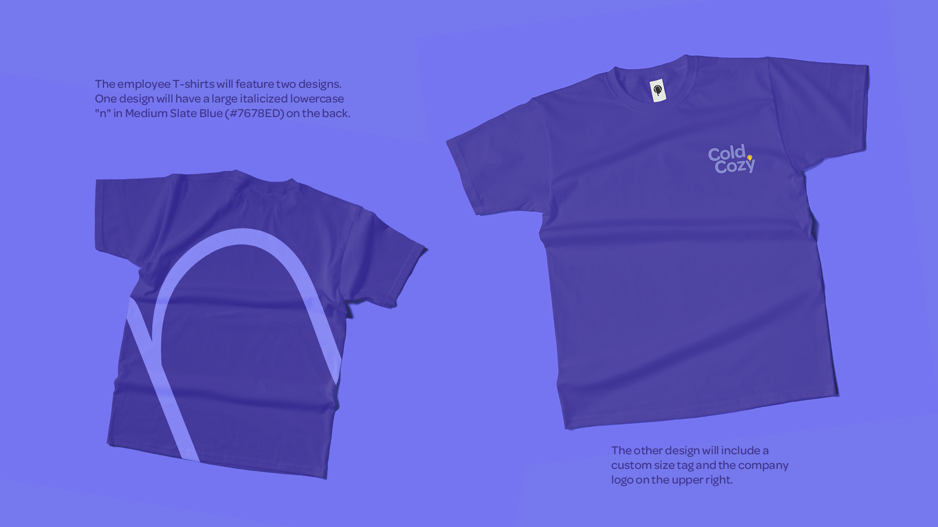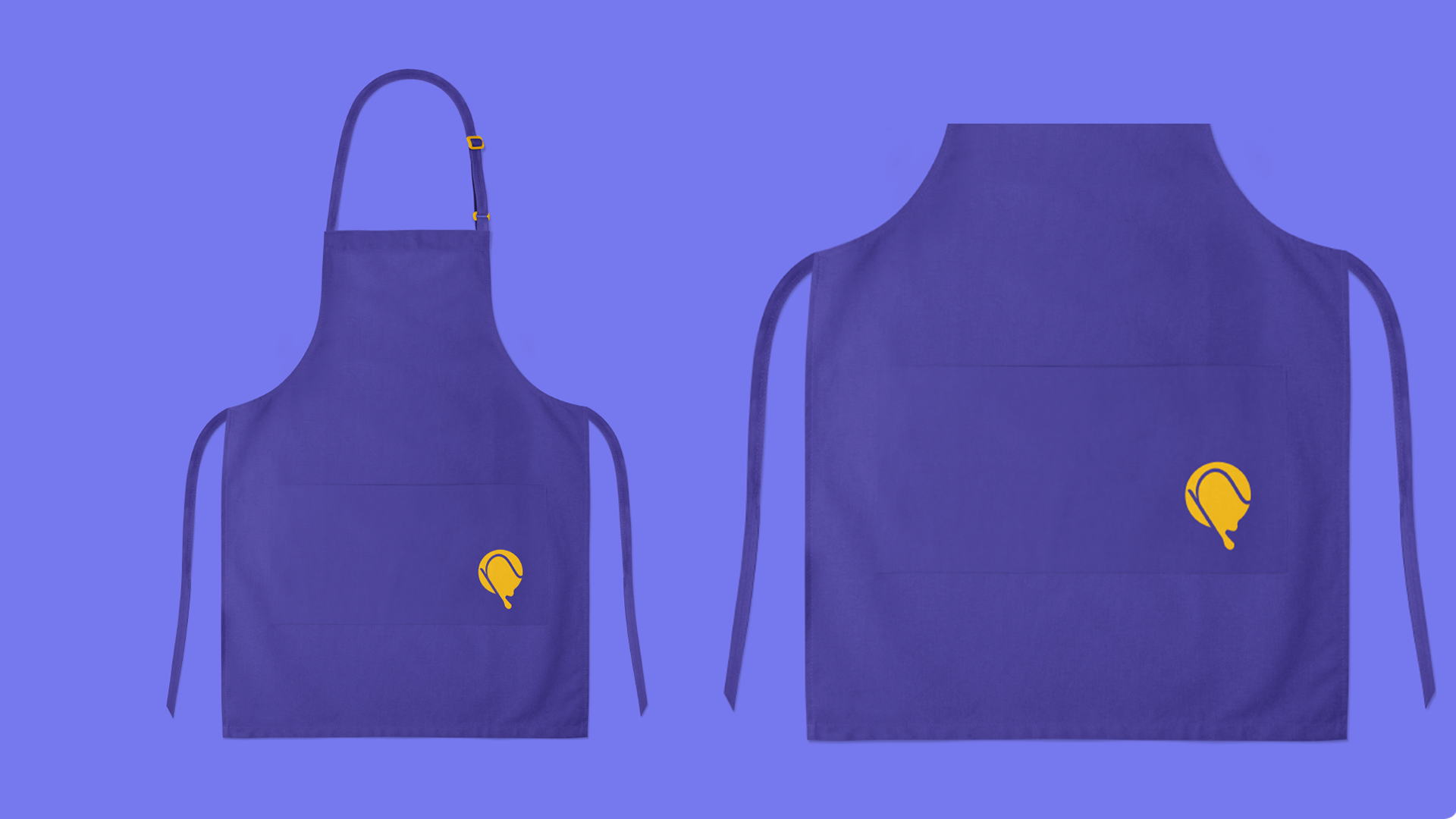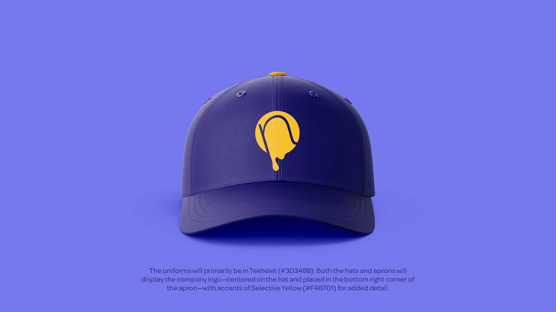


The logo features a wordmark in a semi-bold font, with the two words positioned closely together to convey a sense of comfort. An icon is placed on top of the letter 'y,' and upon closer inspection, it reveals a negative space that resembles an ice cream shape. The colors used in the logo reflect the division's vibe of mystery and fun.
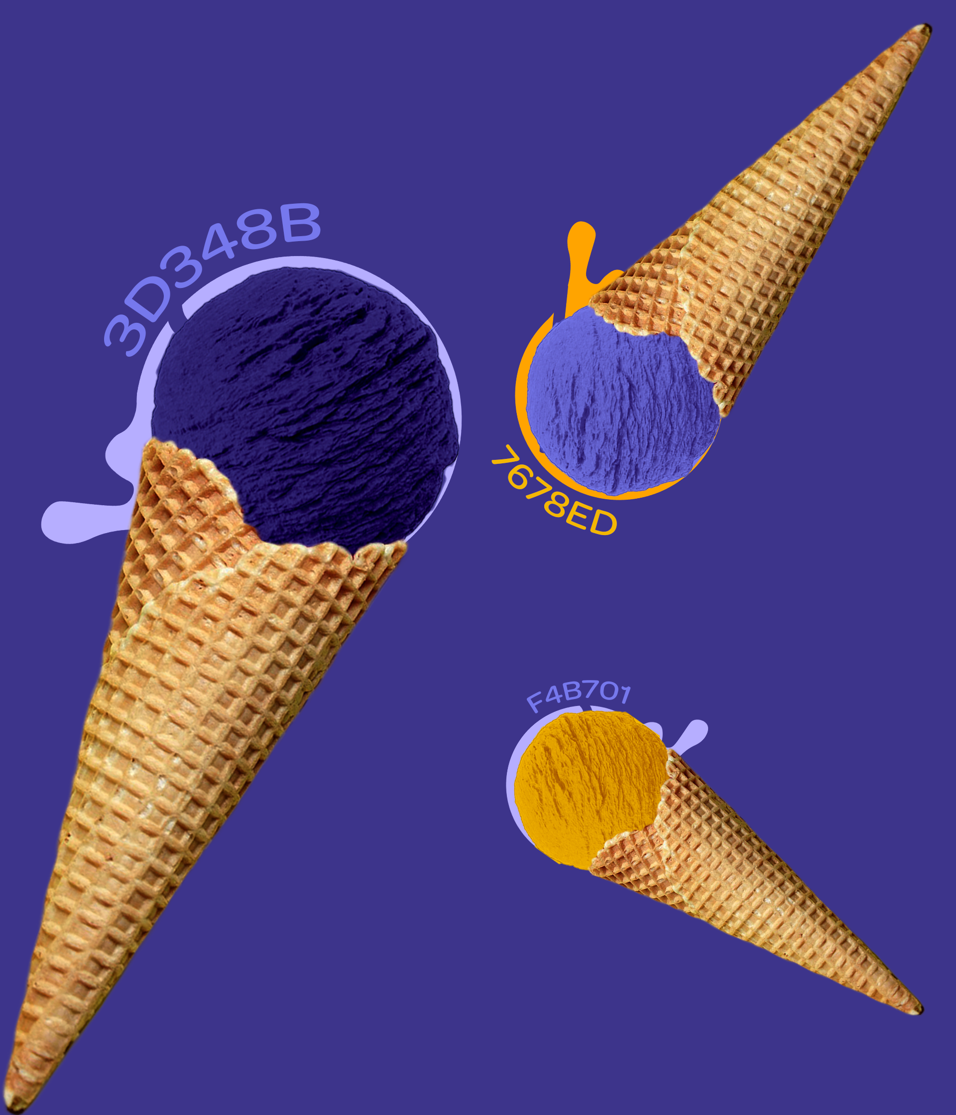
The main colours for the company are reduced to 3 to maintain their vibe as a fun and mysterious ice cream store. Tekhelet (#3D348B) is used as the main background colour for the mystery, Medium Slate Blue (#7678ED) is used to symbolize both concepts of fun and mystery, letting their target audience be full of curiosity on what flavours do Cold n Cozy offers. Lastly, Selective Yellow (#F4B701) is used on the icon and some texts to highlight the fun vibes that the company is giving in which they offer 10 flavours of ice cream that are classic and new to our taste buds!
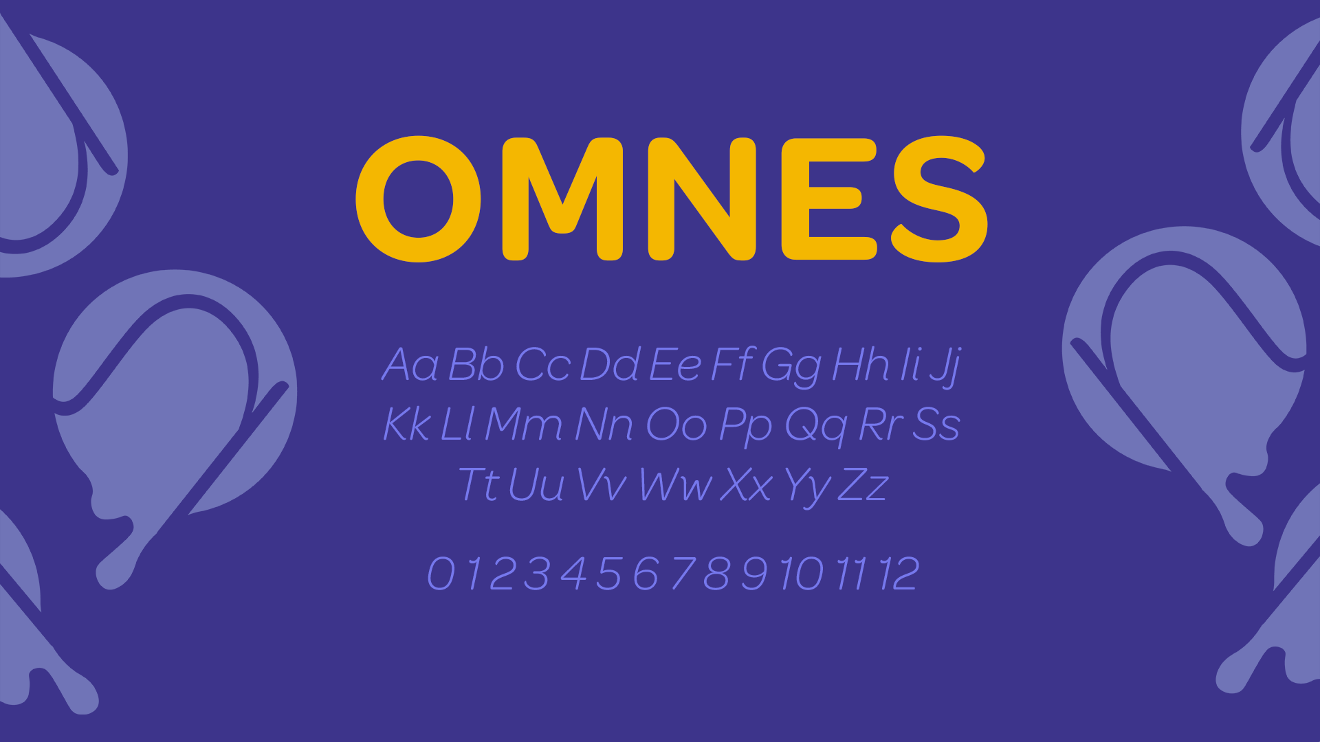
This modern, sans-serif typography with consistent stroke width called Omnes (designed by Joshua Darden) gives a playful feel with its strokes that reminds you of sprinkle toppings for your ice cream.